Summary: Today, shoppers look for a seamless shopping experience across different channels. Here's an interesting take on how we can use the principles of UI/UX design to bridge the gap between online and offline channels - because retailers who adopt omnichannel retail strategies are the ones who will see success with new-age shoppers!
A website tells your brand's story - your retail store also does just that.
And, just as a screen design is the user interface (UI) for a digital asset like a website or app, a retail store's layout and merchandising displays function as the physical interface between a brand and its customers or target audience.
Just as a poorly designed website can drive away potential customers, a bad store layout or displays may also drive shoppers away instead of converting them into customers.
In this article, we look at how we can apply the principles of website design and usability to retail store environments and in-store merchandising displays.
Adopting an Omnichannel Retail Strategy
Customers want to engage with your brand at various touchpoints using physical and digital (or online) channels.
They may discover products on a social media platform, add them to their cart via the brand's website or a marketplace, and then drop in at your store to pick up their order.
They may call a telesales phone number to place their order or even use WhatsApp to connect with the business and browse a product catalog right there within the app.
Or they may click on an email from an online marketplace that stocks the brand they want.

Your customers are already omnichannel.
Nearly 75% of shoppers say they use multiple channels to compare prices, hunt for discounts, or use in-store tablets for online shopping.
Recently, the Harvard Business Review studied 46,000 shoppers and found that "omnichannel customers loved using the retailer's touchpoints. They used smartphone apps to compare prices or download a coupon and were avid users of in-store digital tools such as an interactive catalog, a price-checker, or a tablet."
Today's omnichannel shoppers look for a seamless brand experience across different channels.
Many retailers already use an omnichannel approach to connect the online and physical shopping experience.
For example, big box retail stores like Office Depot use localized product search ads (Google's Local Inventory Ads) to bridge the gap between online traffic and brick-and-mortar store visits.
IDC Retail Insights reported that retailers who used omnichannel marketing strategies saw a 15–35% increase in average transaction size, a 5–10% increase in loyal customers' profitability, and a 30% higher lifetime value than those using only one channel.
Bridging the Gap Between Your Digital Assets and Your Physical Store
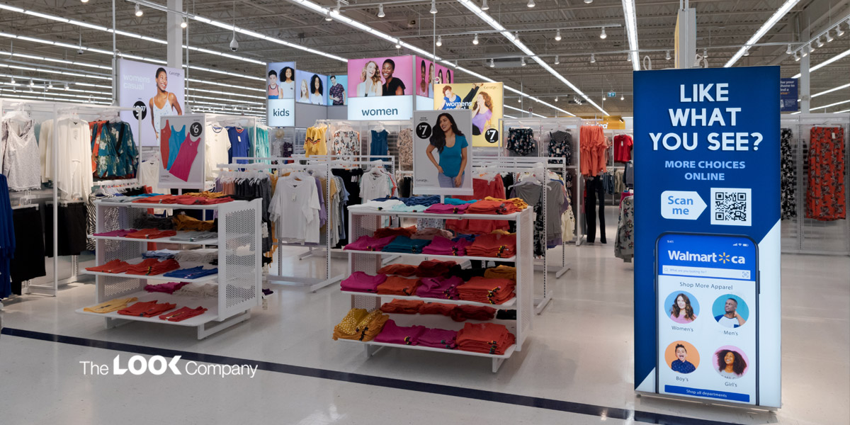
80% of customers shopping in a physical store browse online channels before or during a purchase decision.
To design a successful omnichannel experience, retailers must provide personalized experiences across the customer journey - from running marketing campaigns on channels used by your target audience to making customer service available on any channel your customers prefer.
Retailers must ensure their merchandising strategies are designed to facilitate customers' purchases on any channel.
What if we apply the strategies that work with online channels and use them to improve the customer experience and sales conversion in offline stores?
If design principles are the foundation for the success of both your digital assets and offline store, can you streamline the experience across online and offline channels using the basic UI/UX principles used by website designers?
Using the Principles of UX/UI Design in Retail Merchandising
Any customer-facing asset must be designed in alignment with the goals and values of the business it represents.
Whether it's your website or your physical store, you need to design it with your target audience in mind.
The basic principles of design can help you build a seamless transition from one channel to the next, enhancing the brand experience and converting store visitors to customers.
Let's look at some of the principles of design and usability that we can apply to the retail environment to design engaging layouts and immersive retail merchandising displays:
Using the principles of UI/UX design through the customer journey
Creating a good shopping experience necessitates using principles of UX across the entire customer journey.
For any online sales channel, UX starts with the digital interface. Intuitive navigation is the key to facilitating the customer to discover products and get more information about them, and finally, place an order. And customer-focused navigation to the checkout and payment page is the key to online sales conversion.
Compare this scenario to the user journey in a physical store:
Are you using the basic principles of good UX in your retail store - right from designing displays where the shopper discovers a product to the checkout counter that marks the sales conversion?
What can retailers do to facilitate a shopper's journey through the store - from the moment they enter the store to the time they complete their purchase?
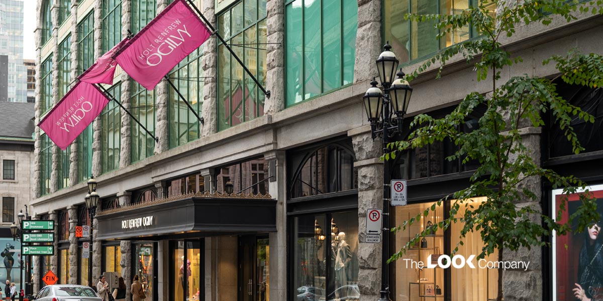
For example, window displays are usually the first point of visual contact a customer has with your store and can often be the difference between a customer entering to see more or just walking on by.
Do shoppers find your store's aisles easy to navigate? Can they locate the products they're looking for? Do they encounter eye-catching merchandising displays that encourage them to add a little more to their carts?
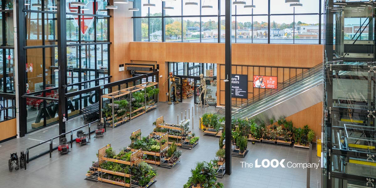
Placing eye-catching product displays and in-store signage throughout the store helps shoppers locate items and navigate to the checkout area.
Finally, are your checkout counters designed to encourage last-minute cart additions and impulse purchases?
Using the principles of good UX throughout the shopper's journey creates a positive shopping experience that encourages customer loyalty and repeat business. Retailers can build strong relationships with their customers by focusing on the customer's needs and providing clear and easy-to-understand information.
Using gestalt principles in your retail store
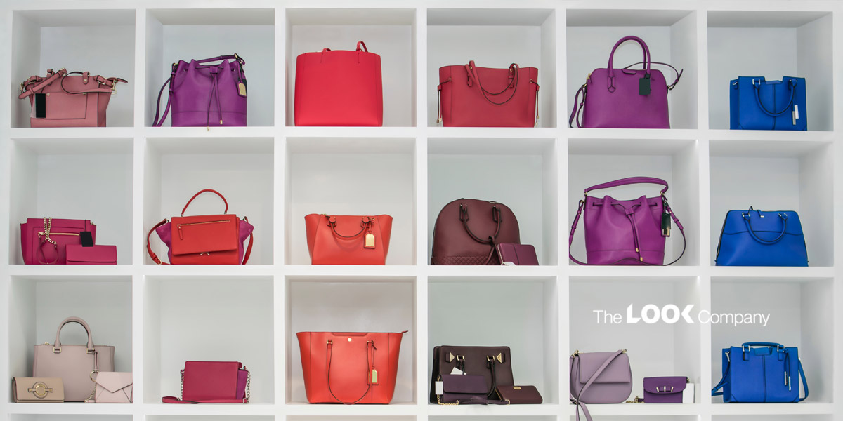
The Gestalt principles of grouping are based on observations of human behavior.
Some of the laws of Gestalt give us clues about designing retail store layouts and merchandising displays.
The law of common region states that elements that are physically nearby look like one group. But if you draw a boundary around some of them, it creates a separate group.
Apply this to product groupings in a big box store:
Big box stores have a large floor area, but you can design product displays in such a way that different products or brands are seen as separate groups, so they receive the attention they deserve from shoppers and are not lost among thousands of products.
The focal point principle states that whatever stands out visually will capture and hold the viewer's attention first.
Use this principle for in-store signage:
Lightboxes are an ideal way to make a product or promotion stand out visually. Their vibrant prints and the contrast created by backlighting draw the shopper's attention. You can also use wayfinding signs creatively to direct shoppers to the all-important checkout area by creating a focal point that can't be missed. Similarly, you can use this principle to design pricing signs that will grab attention during a sale or special promotion.
Using minimalistic design
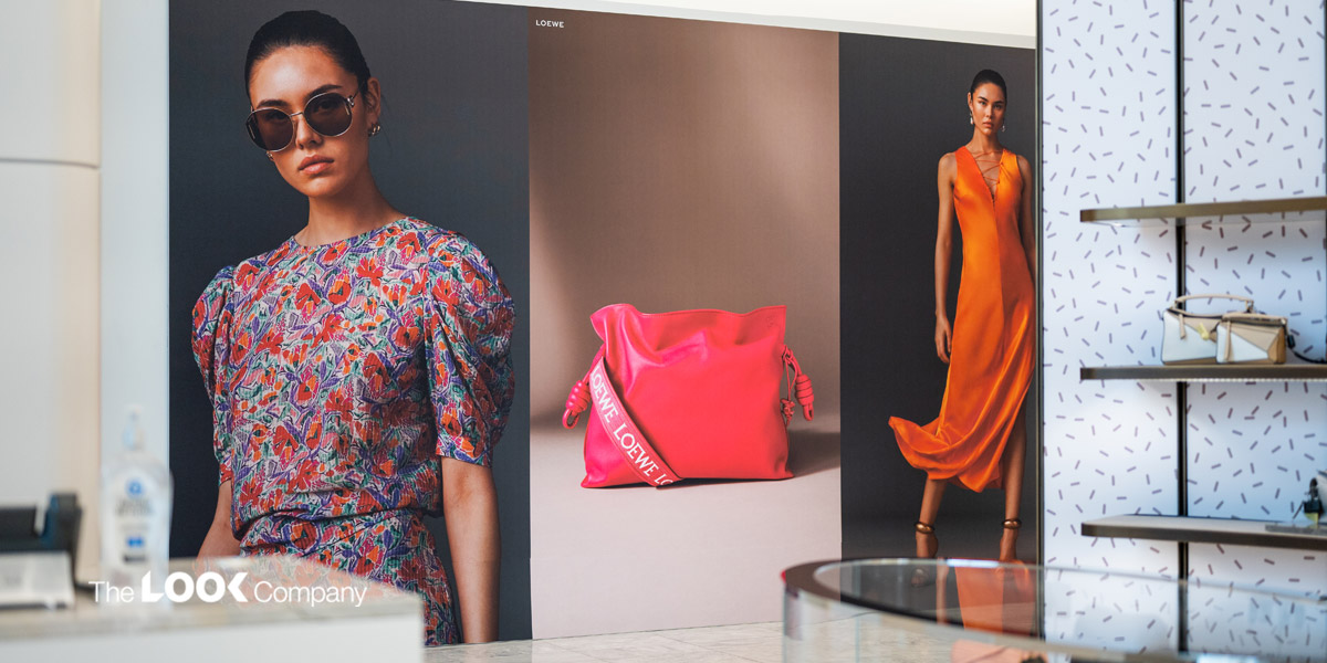
Minimalistic design keeps clutter out so users can focus on the conversion action without distractions. This basic principle of good design applies to online and offline channels alike.
Retail stores should enable shoppers to focus on the merchandise and make their selections without clutter.
Are your store layouts cluttered? Are shoppers comfortable walking through the aisles of your store? Or is the store décor too overwhelming and stressful for shoppers?
Pro Tip: Study the store's CCTV footage to find out how many visitors move out before walking through the store.
Using principles of usability testing: Squint tests and scenarios
For digital experience designers, the idea behind usability testing is to understand how easy or hard it is for your users to use your app or website, complete specific actions, and understand what users expect.
Scenarios are the core of usability testing and help designers focus on users' needs. Squint tests give a high-level view of the visual hierarchy in the design. These tests show what design elements will grab the users' attention first. They also identify where the primary focus should be. Finally, they alert designers if too many elements on the page confuse the eye.
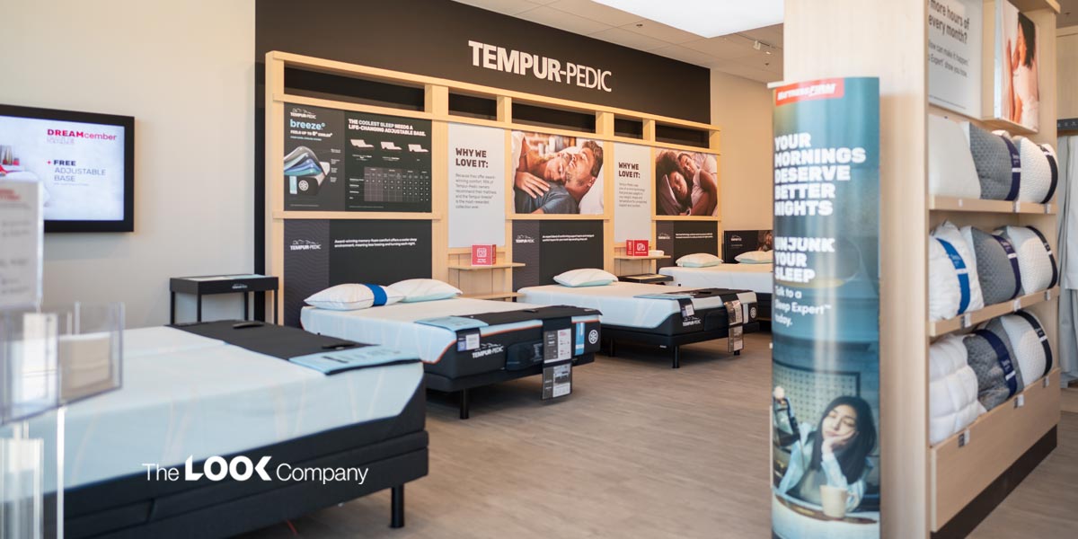
Apply the principles of usability testing to a retail environment:
Can visitors easily find their way to the checkout counter in your store?
Or do they go around in circles in a maze of aisles and lose their patience? (they may not return to your store for another visit if the store layout is too confusing or time-consuming).
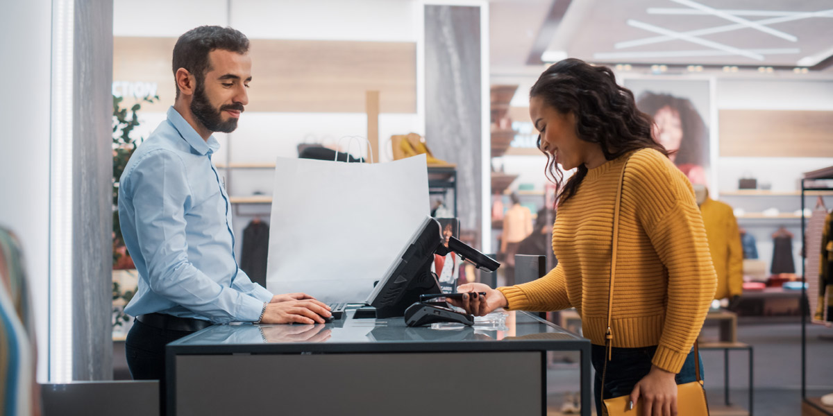
Once at the checkout, do you have convenient payment options and express checkout to give shoppers a positive store experience as they leave? (maybe reward them with loyalty points or a discount coupon valid on their next visit?)
By observing how visitors navigate your store and studying various scenarios, you can identify changes to your store's layout, product placement or display arrangements to optimize the shopping experience.
Design Effective Retail Environments with TLC's Visual Engagement Solutions
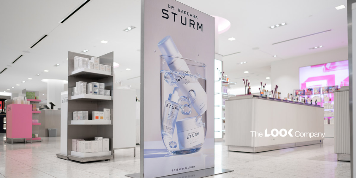
The Look Company provides retailers with a range of visual engagement solutions so they can align their retail environment to their customers' needs and create a positive user experience.
We support your designers and merchandisers with display systems and signage solutions so they can craft attention-grabbing experiences throughout the shopper's journey from their store entrance all the way to the checkout!
Get in touch with TLC today to discuss how TLC's visual engagement solutions support your omnichannel retail strategy.
