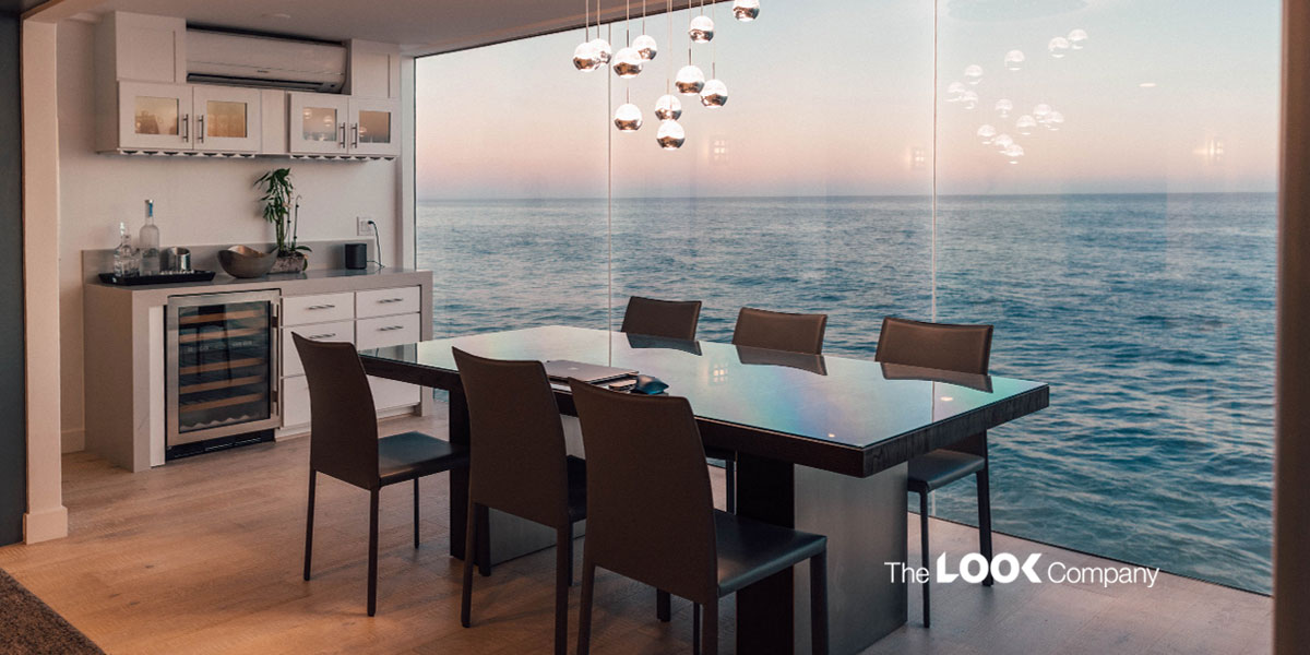
Designing the layout of a furniture store is an art—with a studied set of retail principles to back it.
Brick-and-mortar furniture stores rely heavily on their design and ambiance to sell their merchandise successfully. Furniture store design requires thoughtful planning, with thematic zones that allow a smooth flow of visitors through the various sections. The challenge is to recreate the setting for which the furniture is designed. Yet, the layout must be minimalistic, with a complimentary color palette to allow the design and color themes of the furniture to shine through.
First Impressions Count: Design the Entry Zone With Care
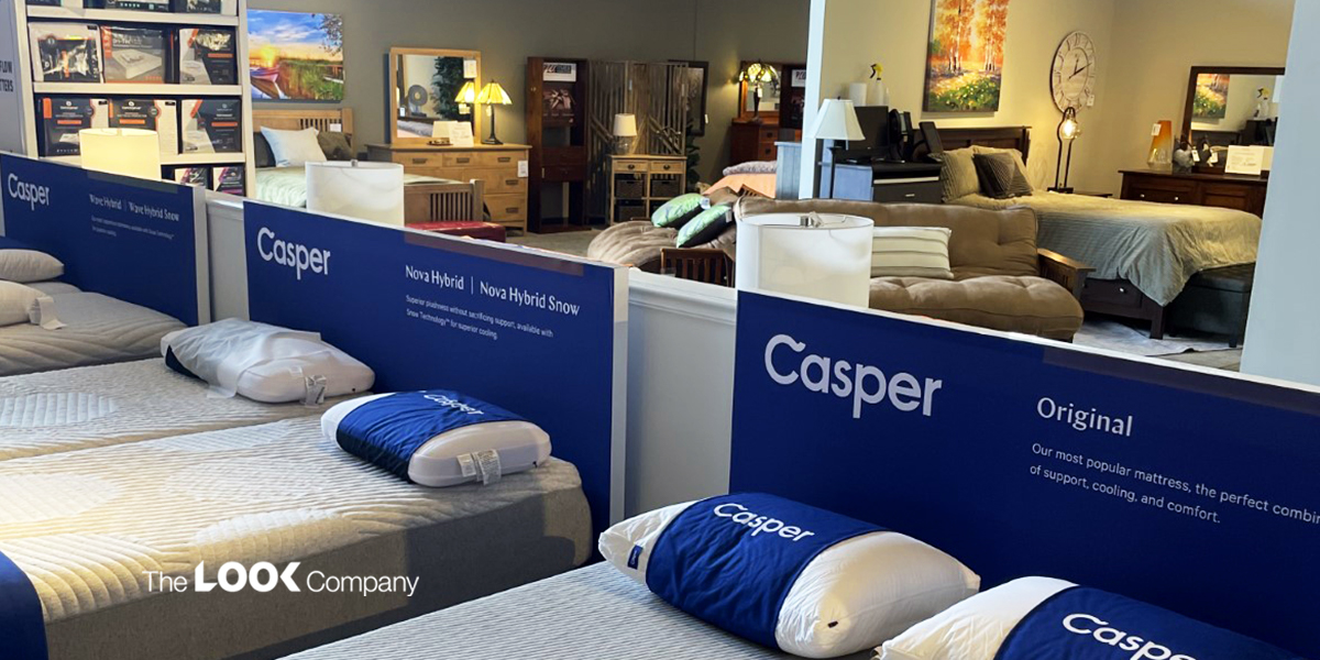
As visitors enter your store, remember that they're stepping into your brand's world.
The first 5-10 feet form a 'decompression zone' which is best used to create an environment that allows visitors to take in the experience of the brand. It's where visitors form their first impression of the store and decide which way to turn to start shopping. Use this space to design displays that tell your brand's story or hold a promise of what's inside without being too salesy. Fabric-printed vignettes that span the entire wall and seamlessly run over columns or up to the ceiling are a great idea. Wall mounted graphic treatments can be constructed to any shape and size. Our frame solutions are flexible so that you can fasten them onto any wall structure, whether drywall or concrete.
Optimize the Zone of Maximum Exposure
Retail gurus say that store visitors prefer taking the first turn to their right once they enter your store. And that's your zone of maximum exposure - also popularly called the power wall. Design a high-impact visual display that commands the attention of store visitors and draws them to the product range you want to promote. Use wayfinding systems directional signage with flags, banners and floor decals to direct traffic from this point. Maximize the power of this space with graphics that showcase seasonal specials, on-sale or high-margin products.
Create Space—or Risk Having Visitors Walk Past a Cluttered Product Display Area!
Spaciousness is probably the single most important aspect of furniture store design. Consumer behavior expert and retail consultant, Paco Underhill, in his book 'Why We Buy: The Science of Shopping' speaks about how shoppers (usually women) avoid overcrowded aisles where there may be a tendency to brush against people. Many don't venture into areas where there isn't enough aisle room. The store design should allow for enough space for families to walk around each piece of furniture, try it out, and re-imagine how their home will look with this new, coveted piece! Modular frames with integrated fixtures give store designers the flexibility to create pleasing displays without hindering traffic flow.
Create Thematic Sections and Add a 'Speed Bump'
As visitors browse through your furniture store, you want them to stop at strategically placed displays. That's where you add a speed bump - a display or offer that is distinctly different from the surrounding ones, prompting visitors to pause and take a closer look.
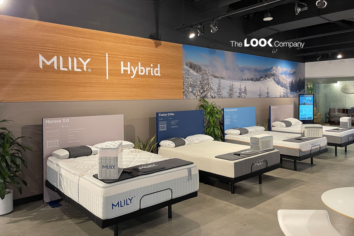
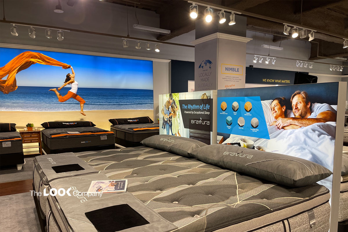
For example, in a section that promotes mattresses, recreate a bedroom. Add elements to the layout and design that encourage visitors to spend more time exploring the area. For example, you can design discrete nooks where visitors can try out the feel of a mattress and get more guidance from a sales consultant on the product that will suit them the best.
In a section for garden furniture, recreate an outdoors-themed environment. Use lightboxes with vivid images of lush greenery and maybe even the laughter of a family enjoying a barbeque lunch. Display patio furniture in that setting and visitors are bound to pause to enjoy the scene!
Modular partition systems provide unlimited design capabilities: Create headboards, walls, corners, booths and even complete rooms. Use large format graphics and full-wall fabric treatments to recreate a home setting. The more time visitors spend engaging with the displays, the more likely they are to make a purchase.
Experiential Furniture Store Design Concepts
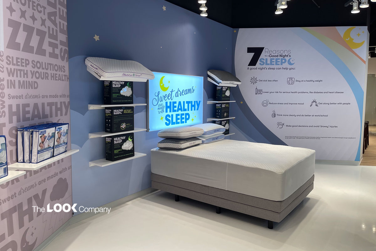
Engage the senses creatively and encourage visitors to explore and interact with furniture displays in your store. Textures, vivid backlit imagery and sounds all add to the experience. You can also create "touch moments" where visitors can get a feel of merchandise such as mattresses and bed linen. Even trying out an easy chair or figuring out which pillow suits you is an experiential moment! An excellent way to engage visitors is to provide informational display signage that details product specifications. Or allow customers to interact with a touchscreen to explore color options for textiles or accessories such as lamps, rugs, pillows, curtains and more.
Choose TLC for Stunning Furniture Store Design Concepts
Furniture store design is about creating a comfortable and inviting space that puts visitors in the right frame of mind to make a purchase.
Modular displays that are easily changeable are an asset to any furniture store. Designers can quickly put together elements for seasonal displays and special promotions and respond promptly to shoppers' in-store preferences.
Our client, Mattress Firm, required a future proof retail display system that could be reconfigured with their evolving store layout and inventory. The system also needed to be easily installed by in store staff and updated at regular intervals.
We provided a modular display system including self-standing product displays, on-the-wall frame displays, lightboxes, and ceiling-hung frames that could easily be changed and reconstructed based on the store design concept, inventory levels or visual merchandising goals.
Talk to The Look Company for dynamically changeable modular displays to create stunning furniture store designs. Our modular display systems allow for multiple uses and increased functionality.
