Summary:
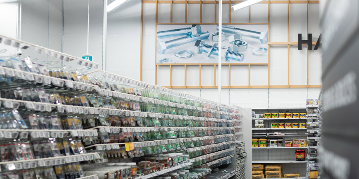
Successful hardware retailers focus on effective in-store displays and store layouts that influence purchasing decisions and improve the shopping experience.
In this article, we discuss some ideas to make your hardware displays impactful and talk about strategies for success based on retail design tactics.
Hardware retail benefited from the DIY activity surge throughout 2020 and 2021, as consumers spent more time at home and focused on converting homes into workspaces.
The home improvement market is set to grow at a CAGR of 6.40% till the end of 2028, with revenues reaching around USD 514.9 billion. And there are over 90,000 hardware stores across the US. To stay competitive in such a dynamic market, hardware retailers must follow DIY consumer trends closely and develop an adaptive visual merchandising strategy to improve in-store sales.
Though the popular conception is that visual merchandising is most important for categories like fashion or fresh groceries, it is, in fact, as critical or even more so for hardware retail!
The Look Company specializes in visual engagement solutions for retail. We have the right visual merchandising solutions to keep your hardware retail store current and relevant with graphic banners, signs, lightboxes, modular frames, and fabric prints.
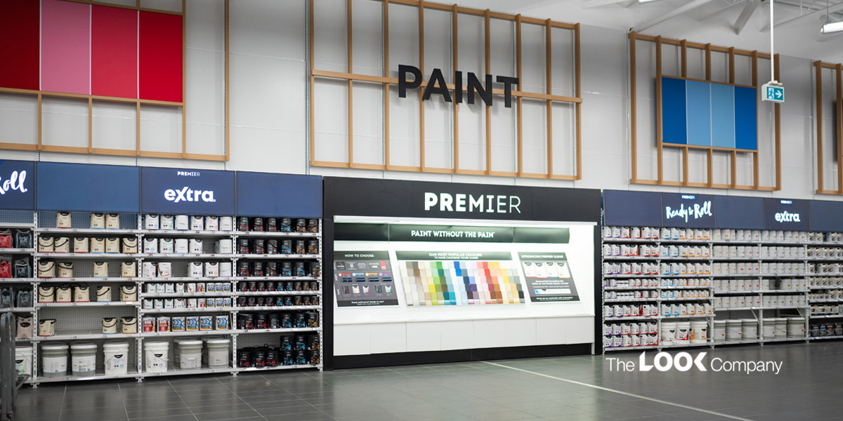
In-store displays reflect what your hardware store has to offer. So make sure your hardware displays are innovative, imaginative and inspiring. Effective in-store displays influence your customer's purchasing decisions and improve the shopping experience.
Here are some ideas to make your hardware displays impactful:
5 Ways to Focus on the Customer's In-Store Experience
Retailers who focus on creating a unique, personalized and engaging in-store experience will steer their retail business toward growth.
#1 Power up your hardware displays
When customers enter a store, an eye-catching display up front should make them slow down, then steer them to the right. Why to the right? Studies show that shoppers usually prefer to move to the right and walk counterclockwise around the store, says Brian Dyches, Chief Experience Officer of retail branding firm Ikonic Tonic in Los Angeles. Known as a power wall, you can use it to feature your top promotions, so shoppers pause before they hurry onto their target section of the store and buy something more than what they came to purchase.
#2 Group your products innovatively to inspire awesome DIY projects!
Another retail design tactic is to expose products to shoppers in a structured manner, classifying them by their purpose or area of use. Position the right tools, consumables or accessories with each product category to make the best use of cross-merchandising techniques and encourage an add-on sale to the main product. For example, position batteries next to power tools, display greasing oil next to machined equipment, and insulated duct tape next to electrical goods.
#3 Leverage your customers' impulse to purchase
Impulse purchases can drive up cart value. Position quick-selling products such as glues, tape, light bulbs, and DIY tools at high-visibility areas such as a store entrance or at the checkout counter to help stimulate impulse purchases.
A recent study on consumer shopping habits by Point of Purchase Advertising International (POPAI) shows just how effective displays are at driving impulse buys. The study showed that 82% of mass merchant purchase decisions are made in-store. In-store displays that consumers noticed while shopping drove 16% of those unplanned purchases.
#4 Light up your store thoughtfully
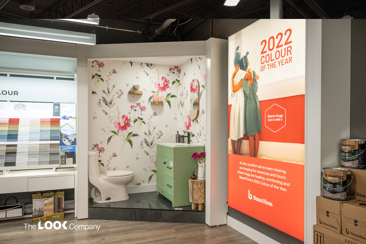
Lighting inside a hardware store is a key retail design tactic that can affect sales. You can use diffuse lighting in areas where you want to create a mellow ambiance, but use accent lights where you want to draw the eye to promote products. The lighting near product display shelves should be sufficient to allow shoppers to read product labels, instructions, specifications and other details, which are critical to making the right purchase decision. Use lightboxes with vibrant imagery to attract attention and highlight featured products and brands. They stand out amongst non-lit graphics as well as interior store lighting fixtures and systems and also extend dwell time. The Look Company offers custom lightboxes that utilize our award-winning printed fabric graphics and customizable modular frames. They are available in many sizes to meet every need, from space-saving slim designs to seamless corner lightboxes and endcap lightboxes.
#5 Use signs and banners to draw shopper's attention
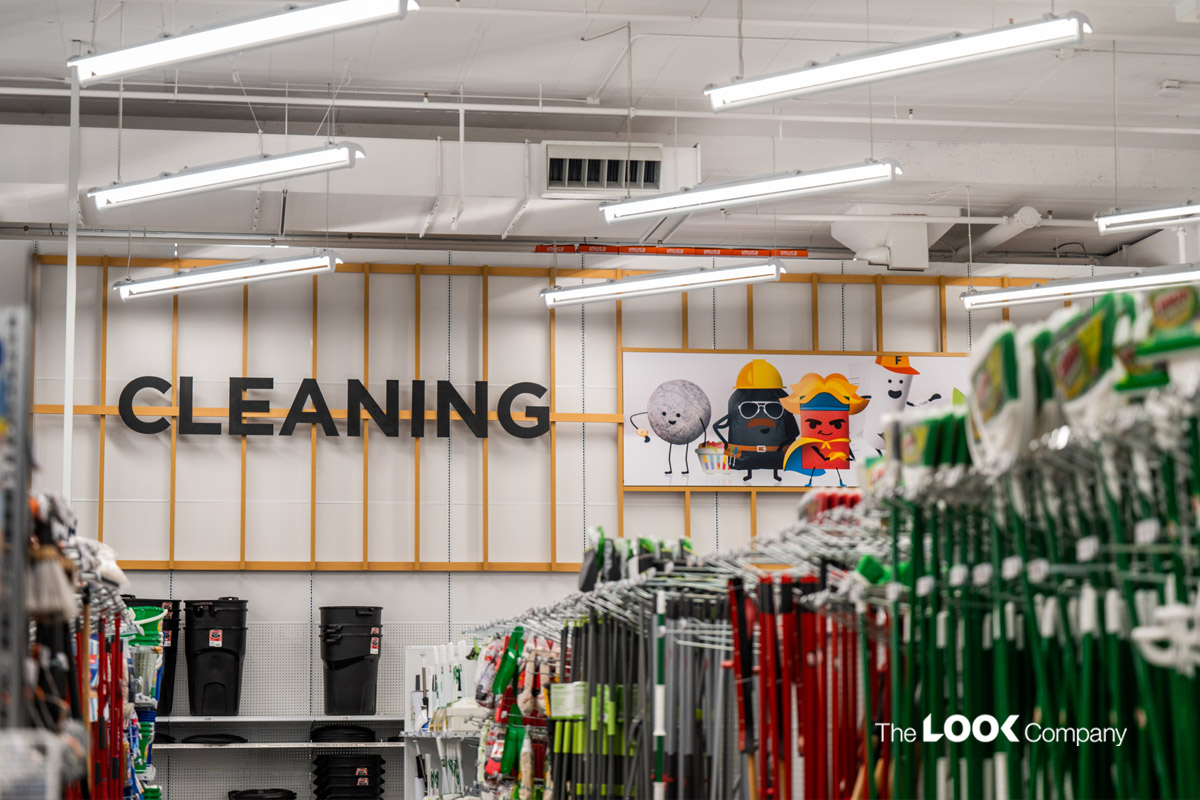
Custom retail signage should be a key tactic in your merchandising strategy. Many retailers use bold, eye-catching signs to indicate price drops, discounts, and competitively priced brands. But make sure the price isn't the largest font on your sign. "Our eye-tracking research shows when the price is the headline, customers will focus on that," says Dr. Bridget Behe, Professor of Horticultural Marketing at Michigan State University. "Make price the byline or a secondary message to the benefits the plants bring to our lives."
Invest in high-quality signage for your hardware store displays. At TLC, we support your visual merchandising strategy with innovative & effective retail signage solutions.
Hardware Store Retail Design Tactics: Strategies for Success
Retailers must study retail design tactics closely and make changes to the store layout, floor plans, aisle layouts and directional signs to improve traffic flow in the store.
How can you optimize your retail space for smooth-flowing traffic? Let's look at some strategies:
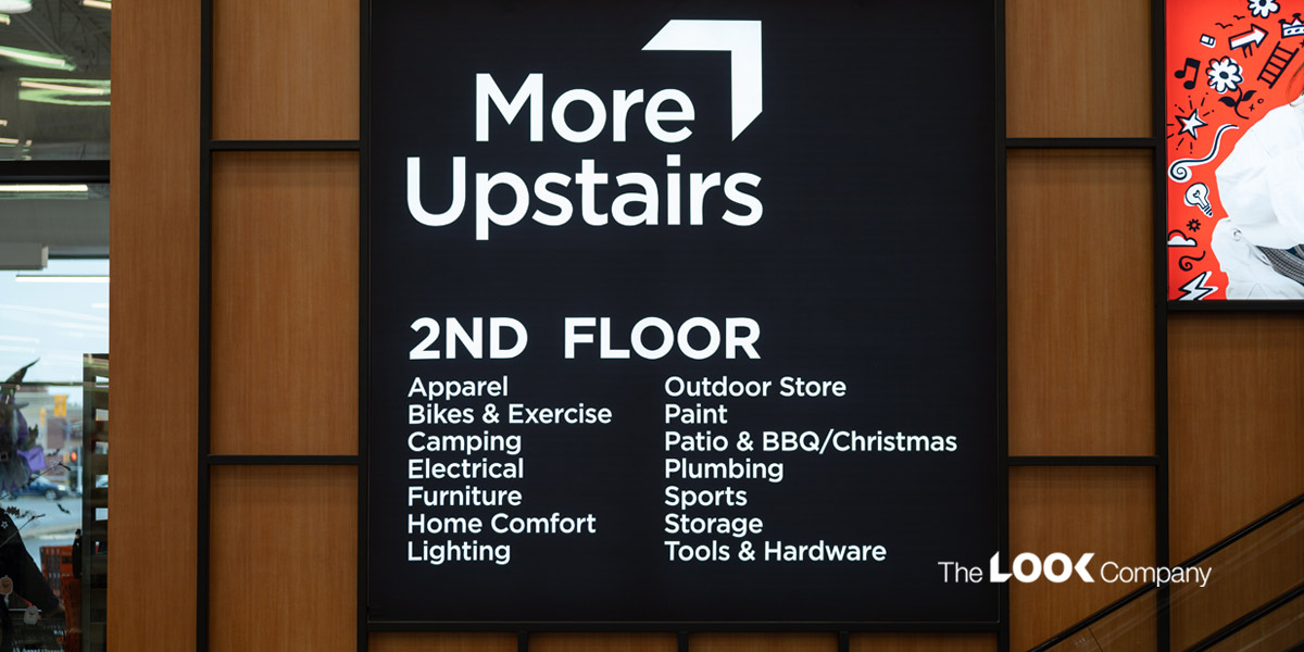
Use wayfinding signs
Large-format stores such as The Home Depot may range from 100,000 to 200,000 square feet. How do these stores ensure that shoppers find what they need? They design the store layout to flow and naturally lead customers from section to section, making it easy for them to find products seamlessly. By leading shoppers around the store, rather than leaving them to figure out how to navigate the aisles on their own, they optimize their showroom space for a smooth flow of foot traffic.
Talk to TLC for signage solutions, including directional, informational and regulatory signs.
Choose the right layout and floor plan
You can trace how shoppers navigate through your store by actively observing or reviewing any in-store CCTV footage you may have. Study customer behavior and traffic flow patterns, and then use the observations to optimize your floor plan to achieve a sales lift.
The loop retail store layout is effective as it guides customers around the store and all the way around to the checkout in a loop between entrance and checkout, so customers walk past all the sections of the store before they finally pay for their purchases. (Think Ikea!).
On the other hand, a free-flow retail store design allows customers to make their way through the sections. It promotes browsing behavior and can encourage impulse purchases if you strategically use directional and informational signage plays based on observed customer traffic paths. This layout can create a unique retail shopping experience and keep customers coming back to explore, browse and be inspired for their next home improvement project!
Maintain a clear line of sight through the store
The line of sight that a shopper's eyes follow as they walk through an area is an important factor influencing what they finally buy. A clear line of sight helps shoppers navigate through the store and locate the products they come to buy. In addition, cleverly used ceiling-hung lightboxes and signs can inspire shoppers to browse through other promotional displays. Remember to place displays at the customers' eye level and control what you want them to see as they enter and exit each aisle or section to drive sales.
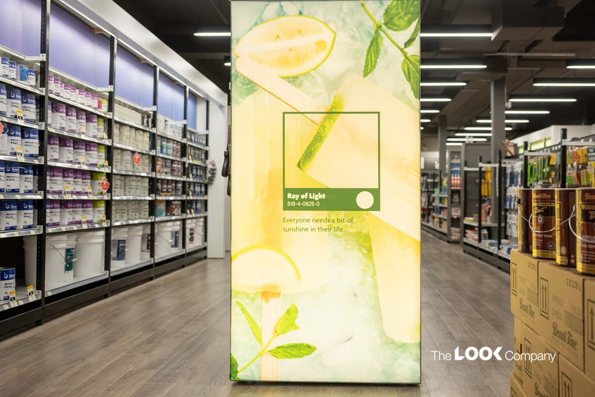
Use endcap displays to influence sales
Aisle layout influences how customers navigate the shop floor and affects product visibility. The space at the end of your aisles is prime real estate and can grab a shopper's attention. Freestanding displays at corners or ends of aisles avoid dead-ends and don't allow shoppers to head back to the main aisle. These endcap displays are highly effective in inspiring shoppers and influencing impulse buys. According to the National Retail Hardware Association, products featured on endcaps sell about 8 times faster than other displays.
Want to learn how The Look Company executed an award-winning graphic solution for Walmart Canada using custom lightboxes and visually impactful endcap displays? Click here to read the details.
The Look Company: Taking Your Hardware Store to the Next Level
Bring your hardware retail store to life with eye-catching in-store displays, lightboxes, custom endcaps, and more visual engagement solutions from The Look Company.
We help retailers leverage the best hardware store retail design tactics to increase sales, achieve growth and improve the shopping experience.
Get in touch with us for more retail design tactics to influence shoppers.
