Grocery shopping is a high-priority and high-stress activity, given the uncertainty of shutdowns and social distancing norms during the pandemic. Retailers must understand the changes in customers' supermarket habits and their emotions toward grocery and home purchases.
Effective graphic displays and in-store signage assist shoppers in getting through their shopping lists quickly and painlessly. Well-placed product promotions and eye-catching displays also inspire shoppers and give them new ideas to try and buy! They lead customers to focus areas within the store, spiking purchases of products featured there.
 For retailers, effective displays maximize precious floor space and achieve increased sales volumes, better conversion rates, and higher transaction values. Even with digitization and technology taking retail by storm, for supermarkets, traditional point-of-sale signages still seem to work best—and that’s partly because there's an element of customers being comfortable with the "known". For example, a 'What's fresh today' sign at a supermarket entrance still works best to draw in customers!
The world's top supermarket chains like Tesco, Walmart, Sainsbury, Carrefour, Sobeys—all employ visual merchandising and retail display and signage techniques to drive traffic and increase revenues. Let's look at how supermarket in-store display solutions increase basket size and drive up revenues:
1. Curbside Signage or Entrance Displays
Curbside flagpole banners or sidewalk A-frame signs induce passersby to step in and explore what's inside the supermarket. Fresh produce, seasonal fruits and vegetables, discounts and promotions, are all crowd-pullers and help get the word out about what's new and what's special.
Entrance graphics displays designed with the creative use of textures like wood for organic products and colors like green and blue convey a sense of freshness, natural goodness, and health—positive associations for supermarkets.
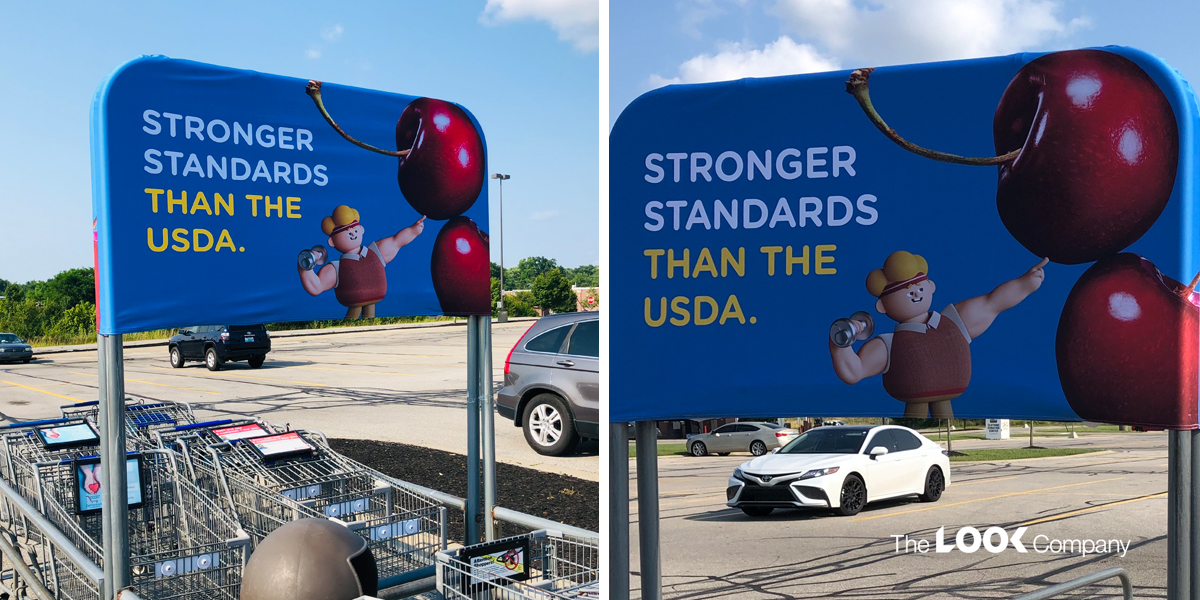
Another innovative solution is branding on buggy corrals. Easily visible as shoppers park up or approach the supermarket, the shopping cart corrals carry your branding and message in a memorable way.
 2. Window and In-Store Displays
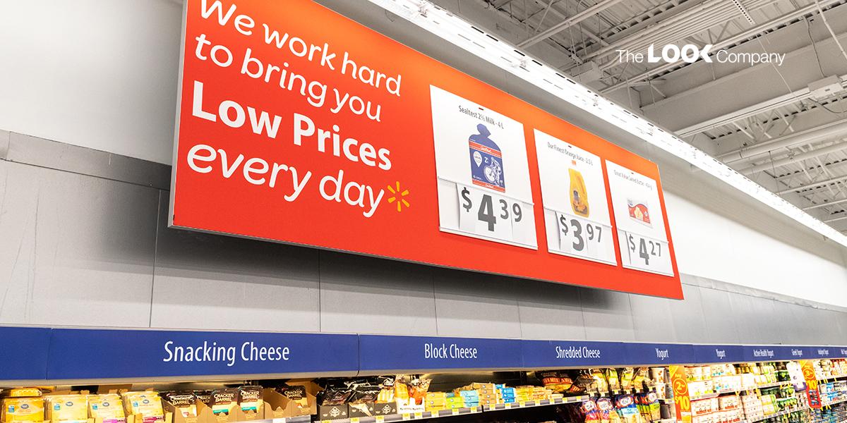
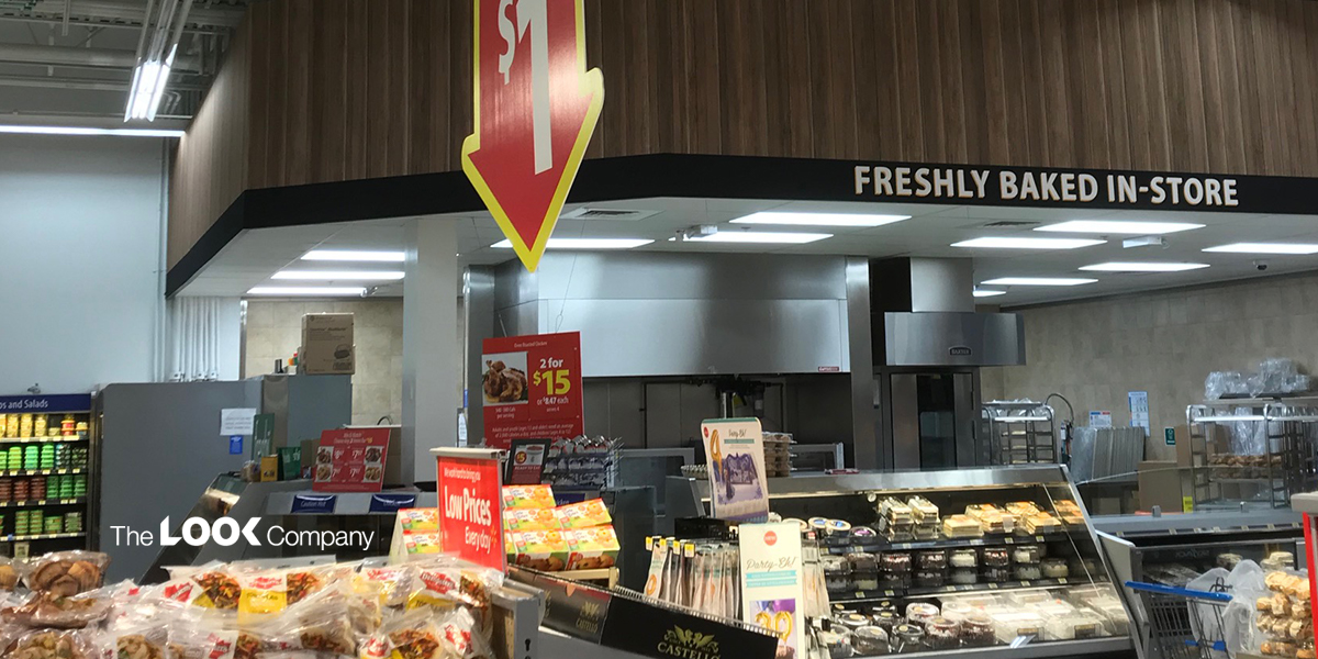
Discount offers, promotions, and new product launches deserve special attention either in window displays or as in-store displays in the form of shelving units, display stands and millwork, and dye sublimation printed flexible banners for walls and ceilings.

Vibrant colors and lighting creates a lively atmosphere and inspires visitors to explore and try out products that are not on their shopping lists! For example, TLC's 50mm lightbox allows you to build lightboxes into product display units without reducing the shelving area.
When display space is at a premium, you need sleek and slender display fixtures to make the most expensive retail real estate. Our 50mm (2") profile lightbox is half the depth of a standard 100mm (4") lightbox. In addition, the thinner profile allows the lightbox to be wall-mounted or integrated into display systems.
3. Supermarket Aisle Signs and Endcap Displays
In-store layouts, aisle arrangements, and intelligent product placements make grocery runs non-stressful for shoppers. Supermarket aisles are designed with great care to ensure that shoppers get through their shopping list—and even go beyond the list! For example, staples like bread, eggs, and milk are usually at the back, so customers walk past several product lines to get to them. That increases the likelihood that they will pick up something else on the way—thus increasing the basket size!
Directional signs or aisle signs help shoppers navigate through the aisles of your supermarket. Usually hung from the ceiling, they are easily visible as shoppers walk in, guiding them to locate the aisles with the items on their shopping list.

The end of an aisle may feature an endcap display that usually brings a focus on and drives up sales for new or popular products. Featured products, discounted items or limited period offers work well on endcap display units.
As customers walk through the shop floor, they are most likely to turn right at the end of the aisle, and retailers can gain mileage from featuring their most attractive promotions or new products at this point.
4. Engaging and Experiential Displays
A customer's in-store experience is the most crucial factor determining whether they will keep coming back as returning customers. Supermarkets especially must go the extra mile to entice return visits as customers tend to visit the same store for their regular grocery runs. Engaging them in product trials or food prepping demos and letting them experience the taste, smell or feel of the produce or products creates an opportunity to sell something that's not on their lists. Another great way to increase basket size!
5. The Checkout Counter and Impulse Purchases
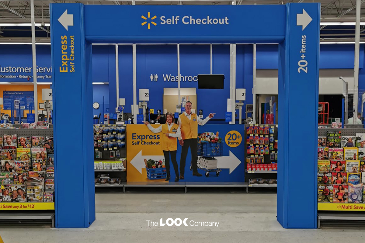
The checkout counter is the one area of the supermarket that every customer must pass through. It's the retailer's last chance to up the basket size. Small items like candy or gum, or a magazine are traditionally placed at checkout. Most shoppers admit to making an impulse purchase during a long and boring checkout line. While products with a marked-down price may be a good idea here, retailers may want to promote a higher-value product here in a bid to increase basket size.

The Look Company's store branding project for Walmart, Canada, won the bronze award at FESPA. We designed signage that can be easily changed to accommodate seasonal and brand promotions by in-store staff at the store level, without the need for specialized staff or tools. Our solutions for Walmart included endcap and in-aisle lightboxes, wall and hanging displays that save floor space, and custom display elements such as self-checkout areas.
Talk to TLC today to see how our display designers can send your supermarket revenues skyrocketing!
