
Retail Decisions Are Made Visually and Quickly
In retail environments, decisions happen fast.
Before a product is touched, or even consciously evaluated, shoppers react to what they see around them. The store environment sets expectations instantly, shaping perception, mood, and trust.
As retail footprints become more condensed and visually crowded, every element carries more weight. Graphics aren’t just decorative—they guide attention, reinforce brand identity, and influence how customers move through a space.
To understand why this matters, it’s important to look at what color actually does in a retail setting and how it impacts the buyer experience.
Color Shapes First Impressions and Emotional Response
Color is one of the fastest ways a brand communicates, often before any messaging is read.
It signals personality:
Premium vs. accessible
Energetic vs. calm
Playful vs. refined
It also influences emotional response. Warmer tones can create energy and urgency, while cooler tones can feel calm, clean, or elevated.
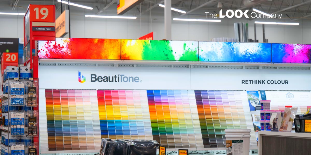
But effective use of color doesn’t always mean bold or vibrant. In many environments such as apparel or premium retail, success comes from precision across a full tonal range, including neutrals, soft gradients, and even grayscale imagery. Subtle shifts in warmth, coolness, or lighting can dramatically change how a space feels.
Even in minimal or monochromatic environments, color still plays a critical role.
For example, black-and-white graphics rely heavily on accurate undertones and balance. A slight shift toward warm or cool can change how premium—or flat—the space feels.
When color appears “off,” it can subtly reduce perceived quality. Customers may not consciously notice, but they feel it.

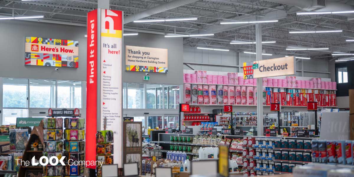
Color Drives Visibility in High-Competition Environments
Retail spaces are saturated with visual information.
Shoppers aren’t always carefully browsing, oftentimes they’re simply scanning.
In this case, visibility determines what gets attention.
Color plays a key role in this, by:
Creating contrast against surroundings
Establishing hierarchy between elements
Directing attention to key products or messages
Saturation and brightness can help, but so can restraint. In some environments, contrast comes from light vs dark, matte vs illuminated, or neutral vs accent tones.
Strong color hierarchy helps customers process information faster, improving:
Product discovery
Wayfinding
Decision-making
Brand Consistency Depends on Color Precision
Brand recognition is built through repetition and color is one of its most recognizable elements.
When color shifts from one store to another, or from digital to physical, it can create friction.
This is especially true for digital-first brands, where customers are used to seeing highly controlled color on screens. Translating that same color into physical environments is not always straightforward.
Even subtle inconsistencies can:
Weaken brand trust
Reduce perceived quality
Create disconnect between channels
Precision isn’t just about matching a color—it’s about delivering consistency across environments, materials, and lighting conditions.
Color Behaves Differently at Retail Scale
Color doesn’t exist in isolation, it’s influenced by everything around it.
In retail environments, several factors impact how color is perceived:
Lighting conditions (warm vs cool LEDs, brightness levels)
Material choice (fabric vs rigid substrates)
Viewing distance and scale
For example, backlit graphics introduce another layer of complexity. The color temperature of lighting (e.g., 4100K vs warmer tones) can shift how graphics appear, especially in grayscale or subtle palettes.
Large-format applications amplify even the smallest inconsistencies. What looks correct in a small proof or on-screen mockup may feel completely different once installed in-store.
That’s why color in retail must be evaluated in real-world conditions, not controlled ones.
Stronger Color Execution Impacts Retail Performance
Color is often seen as a design choice, but in reality, it’s a performance driver.
When executed well, it contributes to:
Stronger shelf and product visibility
Improved brand recall
Clearer wayfinding
More effective campaign rollouts
Fewer costly reprints or refresh cycles
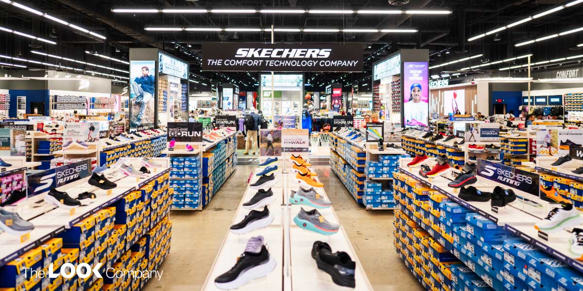
It’s also important to recognize that color strategy varies by retail segment:
Big box & hardware: Focus on consistency, clarity, and scalability across locations
Apparel: Often uses restrained palettes to keep focus on product, requiring precision in neutrals and lighting
Flagship & experiential: Leverages bold, immersive color to create energy and brand moments
Furniture & tech retail: Typically balances neutral environments with targeted color accents to highlight products
Grocery: Uses color for navigation, freshness cues, and category differentiation
In every case, color serves a purpose. The goal isn’t always to stand out but to perform within the strategy of the space.

Retail Standards Are Evolving
Retail has become more experience-driven, and customer expectations have shifted.
Digital environments have raised the bar for:
Color accuracy
Visual richness
Consistency
Traditional print methods were built for a different era, one where expectations for color precision were lower.
Today, brands are re-evaluating how closely their physical environments reflect their intended identity.
This shift isn’t about aesthetics alone—it’s about aligning brand experience across every touchpoint.
Elevating Retail Environments Through Color Strategy
As expectations increase, color needs to be treated as a strategic asset not an afterthought.
Retailers can start by:
Auditing environments for color consistency across locations
Reviewing graphics under real lighting conditions
Considering how materials and scale affect perception
Working with partners who prioritize color accuracy and repeatability
One of the most effective ways to evaluate color is in real life conditions, not on a screen.
Seeing how graphics perform in actual lighting and material conditions provides a level of clarity that digital previews can’t match.
Conclusion: Color Is Foundational to Retail Experience
Retail environments are designed to be felt, not just seen.
Color plays a central role in shaping:
First impressions
Emotional response
Navigation
Brand trust
As retail becomes more competitive and experience-driven, expectations around color continue to rise.
Brands that treat color as a strategic lever and not just a visual detail gain a measurable advantage.
Screens can’t fully capture how color performs in real environments.
Request a free 8-color fabric sample to experience how expanded color range, material, and lighting come together before you scale.
